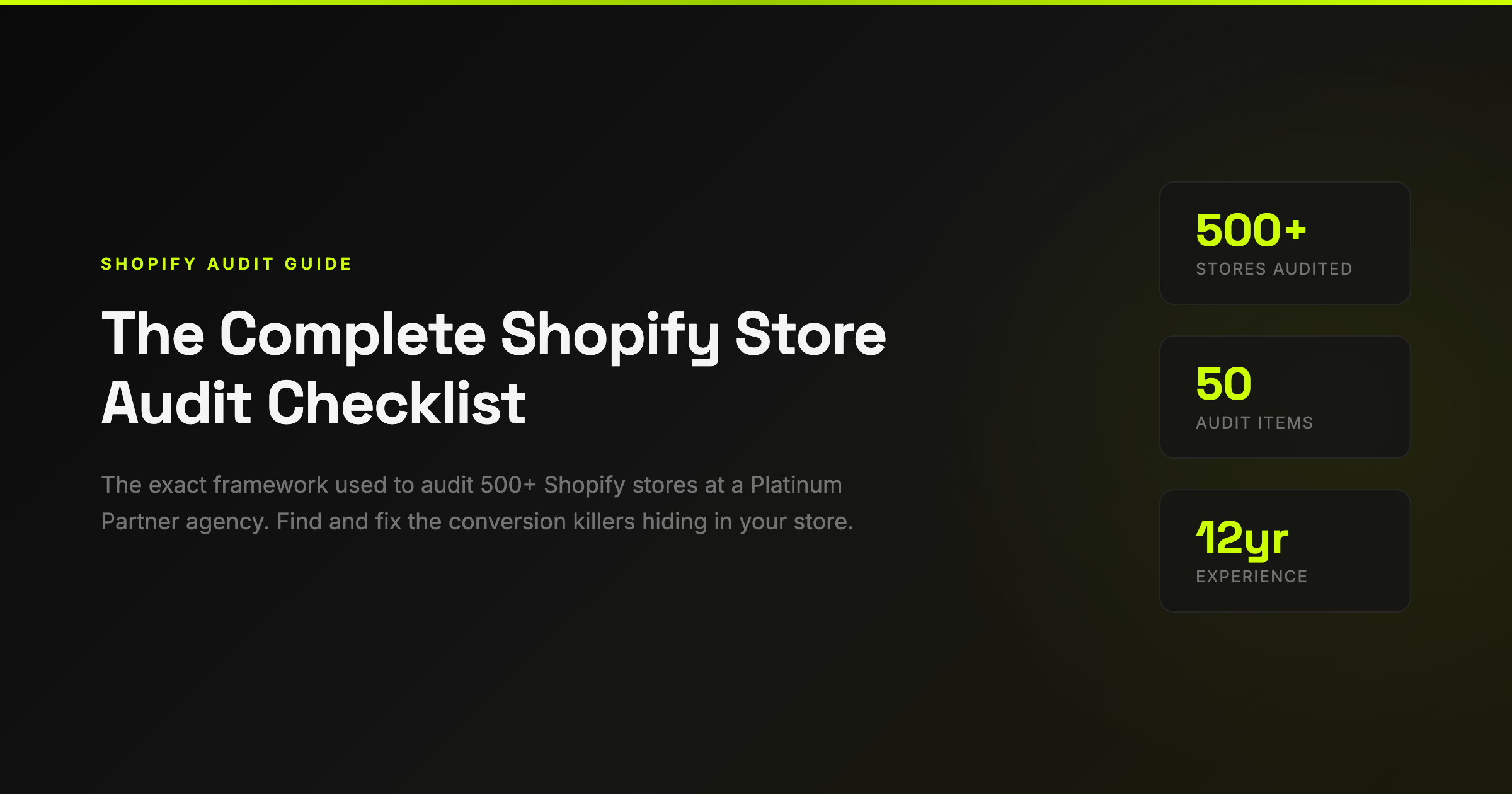
The Complete Shopify Store Audit Checklist (2026)
Every Shopify store is paying what I call "The Store Tax" — the revenue you're losing to fixable conversion issues you don't even know you have.
After 12 years running Eastside Co and building 500+ Shopify stores, I can tell you this with certainty: the average store is leaving 30-40% of its potential revenue on the table. Not because the product is bad. Not because the traffic isn't there. Because of small, fixable problems that compound into massive revenue leaks.
This is the audit checklist we use internally at Eastside Co — the same framework that's helped our clients recover hundreds of thousands in lost revenue. I'm sharing it because too many store owners are spending money on ads when the real problem is their store can't convert the traffic they already have.
Before You Start: How to Use This Checklist
Open your store on your phone (not desktop — 70%+ of your traffic is mobile). Go through each section methodically. Score each item as:
- ✅ Pass — This is working well
- ⚠️ Needs work — Room for improvement
- ❌ Fail — Actively costing you revenue
Every ❌ is money you're leaving on the table. Every ⚠️ is an optimisation opportunity. Focus on the ❌ items first — they'll give you the biggest ROI.

1. Homepage (10 Items)

Your homepage has roughly 3 seconds to communicate three things: what you sell, why someone should care, and what they should do next. Most stores fail on at least one of these.
Value Proposition
Can a first-time visitor understand what you sell within 3 seconds? This sounds obvious, but I audit stores doing £5M+ per year that fail this test. Your hero banner should answer: "What is this?" and "Why should I care?" Don't make people work for it.
Primary CTA Above the Fold
Your main call-to-action ("Shop Now", "Browse Collection", "View Range") needs to be visible without scrolling. On mobile AND desktop. If customers have to scroll to find out what to do, you've already lost a percentage of them.
Trust Signals
Reviews count, press logos, awards, certifications — these should be visible on your homepage. We've seen stores increase conversion by 12-18% just by adding a "Trusted by X,000+ customers" bar near the hero.
Navigation
7 or fewer top-level menu items. Every additional menu item increases cognitive load and decreases the chance someone finds what they want. The rule: any product should be reachable in 2 clicks from the homepage.
Search
Visitors who use site search convert 2-3x higher than those who browse. Make your search bar prominent — not hidden behind an icon. Consider predictive search that suggests products as they type.
Mobile Hero Load Time
Test your homepage on 4G (not WiFi). Your hero image should load in under 2 seconds. Every additional second of load time reduces conversion by roughly 7%. Compress images, use next-gen formats (WebP), and lazy-load everything below the fold.
Social Proof Placement
Customer reviews, UGC, or "as seen in" press mentions within the first scroll. This isn't vanity — it's the second most influential factor in purchase decisions after price.
Kill the Carousel
Homepage sliders/carousels reduce conversion. The data is clear on this. Less than 1% of visitors click past the first slide. Use a single, strong hero image with a clear message instead.
Announcement Bar
Free shipping threshold, current promotion, or urgency message. The announcement bar is prime real estate — use it. "Free shipping over £50" alone can increase AOV by 15-20%.
Email Capture
You need to capture visitors who might not return. Exit-intent popup, embedded form, or header banner. Offer something valuable (discount, guide, free tool) in exchange for their email. Every email subscriber is worth £30-50 over their lifetime.
2. Product Pages (10 Items)

Product pages are where buying decisions happen. This is the most important page on your entire site — and it's where most stores have the most problems.
Product Photography
Minimum 5 images per product: hero shot, lifestyle/in-context, scale reference, detail/texture, and in-use. Video is even better. Customers can't touch your product — your photography needs to compensate for that. This is the single highest-ROI investment most stores can make.
Price Clarity
Price should be immediately visible, not hidden or small. If on sale, show the original price crossed out with the sale price next to it. The "was £X, now £Y" format outperforms percentage discounts ("20% off") in almost every test we've run.
Add to Cart Visibility
Above the fold on desktop AND mobile. High-contrast colour. This sounds basic, but I see stores where the Add to Cart button is below three paragraphs of description. Test this right now on your phone — can you see the button without scrolling?
Delivery Information
This is the #1 most overlooked item in every audit we do. Estimated delivery date on the product page — not buried in a FAQ page. "Order by 2pm for next-day delivery" or "Arrives 14-16 Feb" removes one of the biggest barriers to purchase. Adding delivery estimates alone can lift conversion by 5-12%.
Returns Policy
"Free returns within 30 days" builds buying confidence. Put it on the product page, not just in the footer. A visible, generous returns policy increases conversion because it reduces perceived risk. The returns you get back are far outweighed by the additional sales.
Size Charts
If you sell sized products without a clear size chart, you're guaranteeing returns. Size-related returns are the #1 reason for ecommerce returns. Include measurements in cm AND inches, and consider a fit recommendation tool.
Reviews on Product Pages
Star rating and review count near the price. Full reviews below. Products with reviews convert 270% better than those without. If you don't have reviews yet, email past customers and offer a small incentive. Use Judge.me or Loox — both have free tiers.
Benefit-Focused Descriptions
Your product description should sell benefits, not just list specifications. Don't tell me it's "100% organic cotton" — tell me it's "the softest t-shirt you'll own, and it gets softer with every wash." Features tell, benefits sell.
Scarcity Signals
"Only 3 left in stock" or "Selling fast" — but only if genuine. Fake scarcity erodes trust. Real scarcity creates urgency. If you genuinely have limited stock, show it.
Cross-Selling
"Complete the look", "Frequently bought together", or "You might also like" sections increase average order value by 10-30%. This is free money. Shopify has native support for this — there's no excuse not to have it.
3. Cart & Checkout (10 Items)

Checkout is where the money actually changes hands — and where 70% of carts get abandoned. Every friction point here costs you real revenue.
Easy Cart Editing
Customers should be able to change quantity or remove items without frustration. A clunky cart experience increases abandonment. Make the +/- buttons big enough to tap on mobile.
Free Shipping Progress Bar
"You're £12 away from free shipping" is one of the most effective AOV drivers in ecommerce. We've seen this single addition increase average order value by 15-25% on client stores.
Trust Badges in Cart
Secure checkout icons, money-back guarantee, accepted payment method logos. Customers are about to hand over their card details — reassure them. This reduces cart abandonment by 5-10% on average.
Guest Checkout
Forcing account creation before purchase is conversion suicide. 35% of abandonment is caused by forced registration. Always allow guest checkout. Capture the email through the order process instead.
Express Checkout
Shop Pay, Apple Pay, Google Pay — one-tap checkout converts 1.7x higher than standard checkout. Enable every express payment method Shopify offers. The fewer form fields someone fills in, the more likely they are to complete the purchase.
Cart Abandonment Recovery
You should have automated emails for abandoned carts: first email within 1 hour, second at 24 hours, third at 72 hours. This alone recovers 5-15% of abandoned carts. Shopify has built-in abandoned checkout emails — turn them on if you haven't.
Order Summary Visible
Customers should see exactly what they're buying throughout checkout. Product images, quantities, and totals should be visible at every step. Surprises at checkout = abandonment.
No Surprise Costs
Unexpected shipping costs are the #1 reason for cart abandonment globally. Show shipping costs as early as possible — ideally on the product page or cart page, not at the final checkout step.
Multiple Payment Options
Credit/debit cards, PayPal, Shop Pay, Klarna/Afterpay. Buy Now Pay Later options alone can increase conversion by 20-30% on higher-priced items. Offer every payment method your target customer expects.
Post-Purchase Upsell
After the purchase is confirmed, offer a complementary product at a discount. The customer has already committed — the psychological barrier to an additional purchase is much lower. This can add 10-15% to your revenue with zero additional traffic.
4. Mobile Experience (10 Items)

75% of your traffic is probably on mobile, but it likely only generates 50% of your revenue. That gap is "The Mobile Tax" — and it's almost entirely caused by poor mobile UX.
Thumb-Zone Navigation
Primary actions (Add to Cart, navigation, search) should be reachable with one thumb. Test your site holding your phone in one hand — can you do everything you need to without shifting your grip?
Touch Targets
Buttons should be minimum 44x44 pixels. Links shouldn't be crammed together. Fat-finger taps on the wrong element create frustration. Test every interactive element on a real phone.
Page Speed
Test on Google PageSpeed Insights (mobile). Score below 50? You have a problem. Every second of load time on mobile costs you roughly 7% in conversions. Compress images, defer JavaScript, remove unused apps.
Sticky Add to Cart
On product pages, the Add to Cart button should follow the user as they scroll. Once they've scrolled past the button, make it easy to buy without scrolling back up. Sticky CTAs increase mobile conversion by 8-12% on average.
Readable Text Without Zooming
If customers pinch to zoom on your text, your font size is too small. Minimum 16px body text on mobile. Product descriptions, prices, and CTAs should all be instantly readable.
Forms Are Easy to Complete
Use the right input types (email keyboard for email fields, number pad for phone). Auto-fill should work. Minimise the number of fields. Every unnecessary form field reduces completion by 5-10%.
Images Optimised for Mobile
Don't serve desktop-sized images to mobile devices. Use responsive images (srcset) or Shopify's built-in image optimisation. A 2MB hero image on mobile is unforgivable.
No Horizontal Scrolling
If any element on your site causes horizontal scroll on mobile, fix it immediately. This is a basic UX fail that makes your store feel broken.
Popups Don't Break Mobile
Email popups, cookie banners, and chat widgets must be tested on mobile. If they cover the screen and are hard to close, they're destroying your conversion rate. Google also penalises intrusive interstitials on mobile.
Checkout Works on Mobile
Go through your entire checkout on your phone right now. Enter real details. Is it easy? Is anything confusing? Can you complete it with one thumb? If you struggle, your customers are struggling too — and they're leaving.
5. SEO & Technical (5 Key Items)

Page Titles & Meta Descriptions
Every page should have a unique, descriptive title tag (under 60 characters) and meta description (under 155 characters). These are what appear in Google search results — they're your ad copy for organic traffic.
Image Alt Text
Every product image should have descriptive alt text. Not "IMG_4523.jpg" — but "Navy organic cotton crew neck t-shirt front view". This helps SEO and accessibility.
Site Speed Score
Run Google PageSpeed Insights. Aim for 70+ on mobile. Common killers: too many Shopify apps (each adds JavaScript), unoptimised images, and render-blocking CSS. Remove any app you're not actively using.
Structured Data
Product pages should have Product schema markup (price, availability, reviews). This enables rich snippets in Google — star ratings, prices, and availability showing directly in search results. Shopify themes usually handle this, but verify it with Google's Rich Results Test.
Broken Links
404 errors hurt SEO and user experience. Run a free crawler (Screaming Frog, free up to 500 URLs) to find and fix broken links. Common causes: deleted products, changed URLs, old blog posts linking to moved pages.
6. Trust & Social Proof (5 Key Items)

Reviews Strategy
Not just having reviews — having a system to collect them. Automated post-purchase email at Day 7 and Day 14 asking for a review. Incentivise with a small discount on next order. Respond to every negative review publicly and constructively.
About Page
Who are you? Why should customers trust you? A good About page with real photos, your story, and your values converts better than any marketing copy. People buy from people, not faceless stores.
Contact Information
Real phone number, real email, real address. Live chat if possible. The easier you are to reach, the more trustworthy you appear. Stores with visible phone numbers convert 5-8% higher than those without.
Security Indicators
SSL certificate (HTTPS — Shopify handles this), payment security badges, privacy policy, terms & conditions. These are hygiene factors — customers expect them, and their absence raises red flags.
User-Generated Content
Customer photos, Instagram feeds, unboxing videos. UGC converts 4-5x better than professional photography because it's authentic. Encourage customers to tag you and feature their content on product pages.
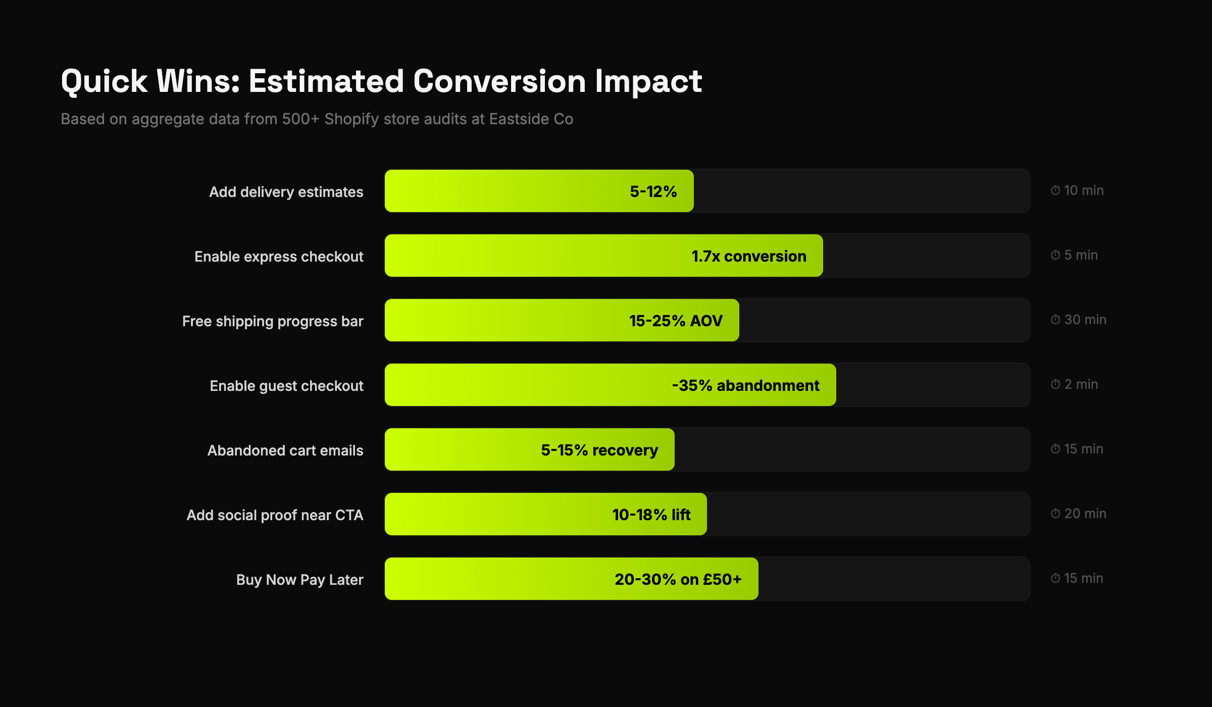
The Quick Wins: Start Here
If you've gone through this checklist and found more issues than you expected (everyone does), here's where to start for maximum impact:
- Add delivery estimates to product pages — 10 minutes, 5-12% conversion lift
- Enable express checkout (Shop Pay, Apple Pay) — 5 minutes, 1.7x checkout conversion
- Add a free shipping progress bar to cart — 30 minutes, 15-25% AOV increase
- Enable guest checkout — 2 minutes, removes 35% of abandonment friction
- Turn on abandoned cart emails — 15 minutes, recovers 5-15% of lost sales
Those five changes can be done in an afternoon and will likely generate more revenue than your next ad campaign.
Want the Full 215-Point Version?
This post covers the essentials — about 50 of the most critical items. Our full audit template goes much deeper: 215 items across 10 categories, with priority scoring (critical/high/medium/low), revenue impact estimates, a completion dashboard, and implementation guides.
It's the exact template we've used on 500+ client stores at Eastside Co. We've packaged it as a Google Sheets template you can use on any Shopify store.
Grab the free 50-point checklist to get started, or get the full 215-point template if you want the complete professional toolkit.
And if you've run the audit and want a second opinion — drop me a line. I read every email.
Jason Stokes is the CEO and Founder of Eastside Co, a Platinum Shopify Partner agency. Over 12 years, his team has built and optimised 500+ Shopify stores for brands including Wild Deodorant, Oliver Sweeney, Origin Coffee, and Condor.
Want the complete audit?
This post covers the highlights. Our full 215-point audit template goes deep on every category — with priority scoring, revenue impact estimates, and an automated dashboard.